สวัสดีครับ ในบทความนี้เราจะมาแนะนำการสร้าง Bar Chart ด้วย ApexCharts ซึ่งเป็น open-source charts Javascript รองรับการสร้าง Chart ได้หลากหลายรูปแบบ ดูตัวอย่างเต็ม ๆ ได้ที่ https://apexcharts.com/
การใช้งานเบื้องต้น
ในตัวอย่างนี้เราจะเรียกใช้งานด้วย Javascript โดยจะต้องมีการนำเข้าไฟล์ Apexcharts ดังนี้
<script src='https://cdn.jsdelivr.net/npm/apexcharts'></script>
ตัวอย่างการใช้งาน
สร้างไฟล์ bar.html และเขียนคำสั่ง Javascript ดังนี้
<!DOCTYPE html>
<html lang="en" >
<head>
<meta charset="UTF-8">
<title>ApexChart</title>
<link rel="stylesheet" href="./style.css">
<style>
#chart {
max-width: 650px;
margin: 35px auto;
}
.apexcharts-menu-item.exportSVG {
display: none;
}
.apexcharts-menu-item.exportCSV {
display: none;
}
</style>
</head>
<body>
<div id="chart"></div>
<script src='https://cdn.jsdelivr.net/npm/apexcharts'></script>
<script>
var options = {
chart: {
type: 'bar',
},
plotOptions: {
bar: {
distributed: true
}
},
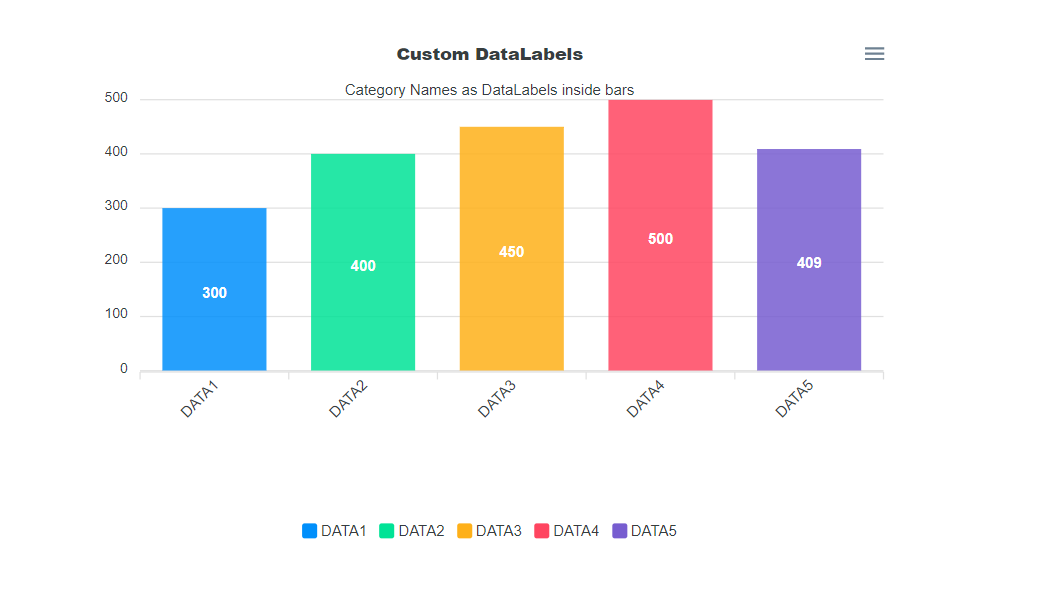
series: [{
name: 'sales',
data: [300,400,450,500,409],
}],
title: {
text: 'Custom DataLabels',
align: 'center',
floating: true
},
subtitle: {
text: 'Category Names as DataLabels inside bars',
align: 'center',
},
xaxis: {
categories: ['DATA1','DATA2','DATA3','DATA4','DATA5'],
labels: {
show: true,
rotate: -45,
rotateAlways: true,
hideOverlappingLabels: true,
showDuplicates: false,
trim: false,
minHeight: 120,
maxHeight: 120,
style: {
colors: [],
fontSize: '12px',
fontFamily: 'Helvetica, Arial, sans-serif',
fontWeight: 400,
cssClass: 'apexcharts-xaxis-label',
},
offsetX: 0,
offsetY: 0,
format: undefined,
formatter: undefined,
datetimeUTC: true,
datetimeFormatter: {
year: 'yyyy',
month: "MMM 'yy",
day: 'dd MMM',
hour: 'HH:mm',
},
},
}
}
var chart = new ApexCharts(document.querySelector("#chart"), options);
chart.render();
</script>
</body>
</html>
ตัวอย่างการทำงาน
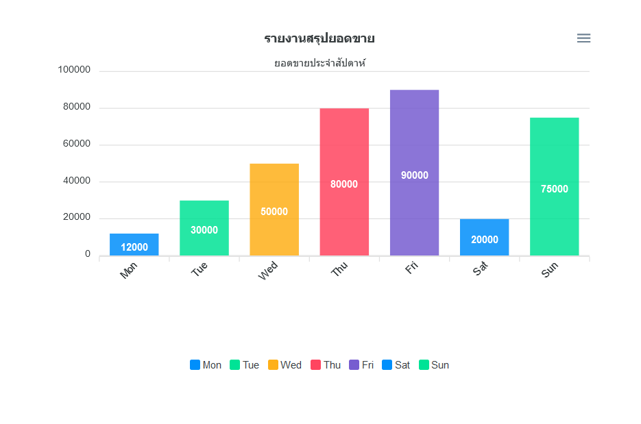
การประยุกต์ใช้งาน แสดงข้อมูล Bar Chart จากฐานข้อมูล ด้วย PHP/MySQL
สร้าง Database ชื่อ test และ สร้างตาราง ชื่อ report ดังนี้
CREATE TABLE `report` (
 `id` int(11) NOT NULL AUTO_INCREMENT,
 `title` varchar(100) NOT NULL,
 `value` int(11) NOT NULL,
 PRIMARY KEY (`id`)
) ENGINE=InnoDB AUTO_INCREMENT=8 DEFAULT CHARSET=utf8
INSERT INTO `report` (`id`, `title`, `value`) VALUES
(1, 'Mon', 12000),
(2, 'Tue', 30000),
(3, 'Wed', 50000),
(4, 'Thu', 80000),
(5, 'Fri', 90000),
(6, 'Sat', 20000),
(7, 'Sun', 75000);
สร้างไฟล์ index.php ดังนี้
โดยในไฟล์นี้จะเป็นการ ดึงข้อมูลจาก MySQL ด้วย PHP และ นำค่าที่ได้ มากำหนดลงในคำสั่ง Javascript เพื่อให้ ApexCharts นำข้อมูลไปแสดงผลเป็น Bar Chart ต่อไป
<?php
	//ตั้งค่าการเชื่อมต่อฐานข้อมูล
	$servername = "localhost";
	$username = "root";
	$password = "";
	$dbname = "test";//กำหนดชื่อฐานข้อมูล
	$conn = mysqli_connect($servername, $username, $password, $dbname);

	mysqli_set_charset($conn, "utf8");

	if (!$conn) {
		die("Connection failed: " . mysqli_connect_error());
	}

	$sql = "SELECT * FROM report"; //คำสั่ง เลือกข้อมูลจากตาราง report

	$result = mysqli_query($conn, $sql);
	$title = [];
	$value = [];
	if (mysqli_num_rows($result) > 0) {

		while($row = mysqli_fetch_assoc($result)) {
			$title[] = $row['title'];
			$value[] = $row['value'];
		}
	}

	mysqli_close($conn);

?>
<!DOCTYPE html>
<html lang="en" >
<head>
  <meta charset="UTF-8">
  <title>ApexChart</title>
  <style>
		#chart {
		  max-width: 650px;
		  margin: 35px auto;
		}

		.apexcharts-menu-item.exportSVG {
		  display: none;
		}

		.apexcharts-menu-item.exportCSV {
		  display: none;
		}
  </style>
</head>
<body>

<!-- แสดงข้อมูล Chart -->
<div id="chart"></div>

<!-- นำเข้า apexcharts library -->
<script src='https://cdn.jsdelivr.net/npm/apexcharts'></script>

<!-- javascript สำหรับเขียนคำสั่งเรียกใช้งาน apexcharts library -->
<script>
var options = {
	chart: {
		type: 'bar',
	},
	plotOptions: {
		bar: {
			distributed: true
		}
	},
	series: [{
		name: 'จำนวน',
		data: <?=json_encode($value);?>
	}],
	title: {
		text: 'รายงานสรุปยอดขาย',
		align: 'center',
		floating: true
	},
	subtitle: {
		text: 'ยอดขายประจำสัปดาห์',
		align: 'center',
	},
	  xaxis: {
		categories: <?=json_encode($title);?>,
		  labels: {
			  show: true,
			  rotate: -45,
			  rotateAlways: true,
			  hideOverlappingLabels: true,
			  showDuplicates: false,
			  trim: false,
			  minHeight: 120,
			  maxHeight: 120,
			  style: {
				  colors: [],
				  fontSize: '12px',
				  fontFamily: 'Helvetica, Arial, sans-serif',
				  fontWeight: 400,
				  cssClass: 'apexcharts-xaxis-label',
			  },
			  offsetX: 0,
			  offsetY: 0,
			  format: undefined,
			  formatter: undefined,
			  datetimeUTC: true,
			  datetimeFormatter: {
				  year: 'yyyy',
				  month: "MMM 'yy",
				  day: 'dd MMM',
				  hour: 'HH:mm',
			  },
		  },

	  }
}

var chart = new ApexCharts(document.querySelector("#chart"), options);

chart.render();
</script>

</body>
</html>
ตัวอย่างการทำงาน
โดยในตัวอย่างนี้ Bar Chart ที่แสดงจะเป็นข้อมูลที่มาจาก Database